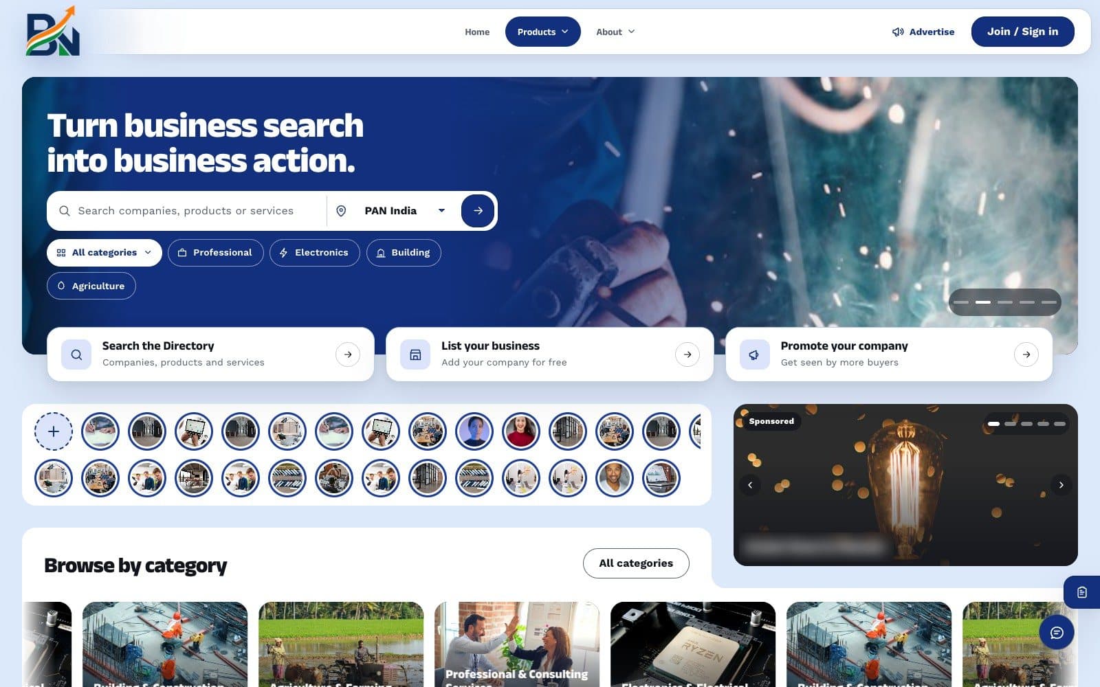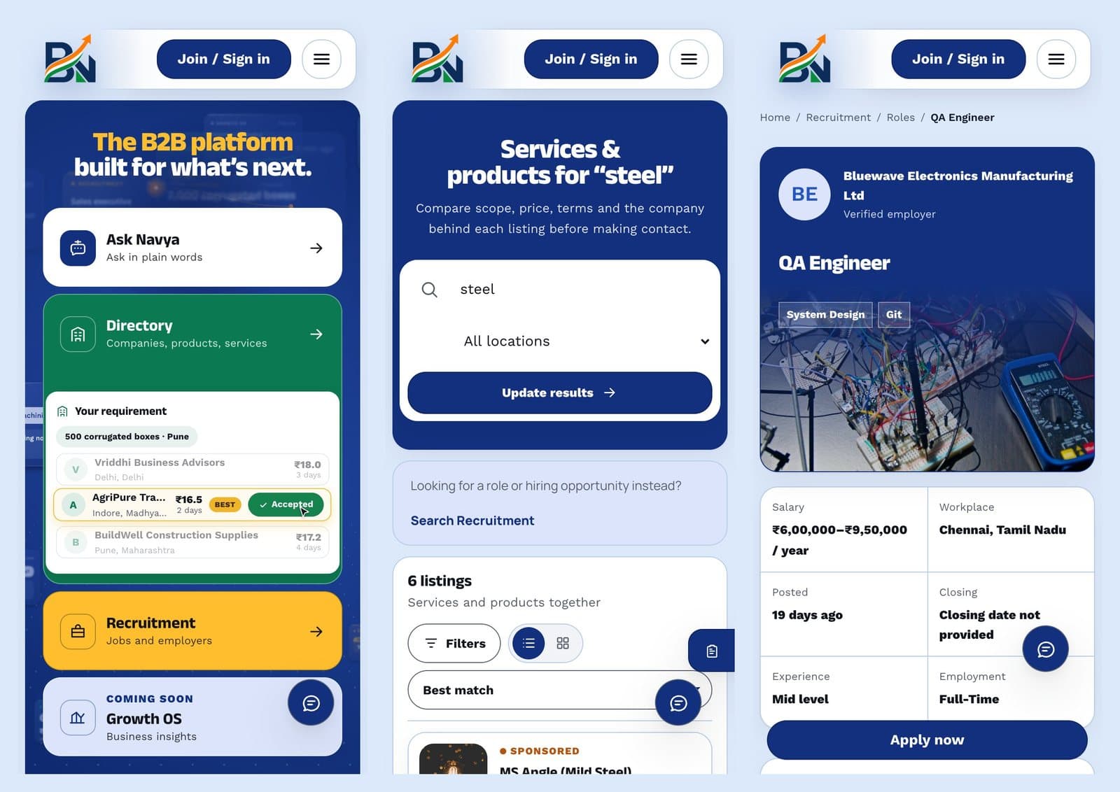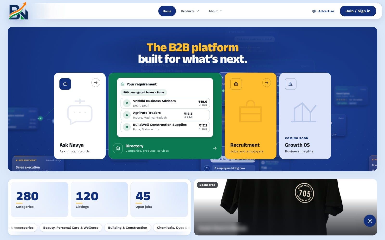
Snapshot
Bharat Navya is a suite for Indian small and mid-sized businesses. Directory lets buyers find companies, products and services and send enquiries or requirements; Recruitment lets employers post roles and candidates apply and track them. One account works across both, and the platform never handles payments: it connects people and earns from plans, ads and boosts.
Context
The audience is mostly non-technical business owners on phones. When I joined, a working proof of concept already existed: a Next.js frontend and an Express API moving from JSON files to Postgres, with plenty of features but no consistent visual language. The brief was to redesign the frontend in place, page by page, while the owner pulled, checked and deployed each change.
Problem
- Many features, no system. Pages had grown independently, each with its own sizes, radii, colours and buttons. Redesigning them one at a time would have kept that drift.
- A shared, moving branch. A backend developer kept merging into the same code, so every change had to merge cleanly and keep existing flows working.
- Phone first for people new to apps. Every screen had to work at 390px without sideways scroll, use native selects, plain words, and show trust signals before someone contacts a seller.
- Feedback by screenshot. The owner and a colleague reviewed on their phones and flagged overlaps and off-centre icons within hours, so polish never stopped.
Approach
I built a token system first and migrated the code onto it. I defined colour, type, radius and spacing tokens, wrote the rules down as a design-system document, and migrated about 1,400 font-size and radius declarations. Seven type sizes and five radii remain, so every new page starts consistent.
I kept backend changes small and additive. I worked against the existing API and only added what the design needed: badge and category fields on seller cards, a contact form with an admin inbox, and a rate limiter fix. Each change went into the handoff notes for the developer.
I made trust visible in lists. Company badges (Verified, Trust seal, GST, Top rated, Fast reply) show as colour-coded chips with a rating pill on search rows, cards and company pages, plus a filter for them. On phones the extra chips collapse to icons so a row stays short.
I kept motion in service of the content. The home hero is a canvas scene of product cards handing off to each other: question to match, RFQ to quote, job to candidate. Text reads without it, it pauses off screen, and reduced motion gets a still frame. I built option boards first so the owner could choose.
I finished with an audit instead of trusting the pile of fixes. I crawled every public page and dashboard tab at phone and desktop width as three demo accounts, checked every internal link and clicked through the main flows. That surfaced a real bug: the login rate limiter also counted the session check that runs on every page load, so signed-in users were logged out after about ten reloads. I scoped the limiter to login attempts and made the client keep the session through temporary errors.
Tech
- Next.js 14 App Router, React 18 and TypeScript, with Tailwind mapped onto the same tokens as the custom CSS.
- Express API whose store layer runs on Postgres or JSON files behind one interface, with numbered schema migrations.
- GSAP and ScrollTrigger, loaded on demand, for section motion; Canvas 2D for hero scenes.
- Headless Chrome over the DevTools protocol for screenshots, overflow checks and flow tests.
What I learned
Most of the value came from refusing one-off fixes. Once the tokens and written rules existed, screenshot feedback became small, predictable changes instead of new styles. The audit taught me the rest: a polished surface was hiding a bug that signed people out, and I only found it by moving through the site the way a user does. Sharing a branch with another developer also taught me to keep commits small and handoff notes current, which mattered as much as the code.